
Key Takeaways
Color Focuses and Engages Design begins with understanding the audience, mission and purpose of the space, and how people should feel in the space.
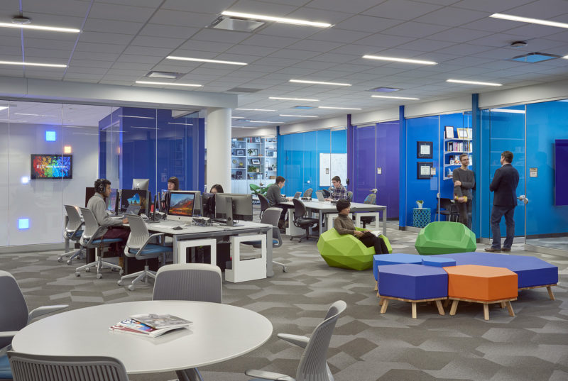
Color Affects Emotions The right color palette will invoke the intended feelings and create positive experiences.
Color Establishes Identity It brings the project alive, sets the mood for the space and reinforces the culture.
Color is a communication tool – it creates the personality and sets the mood of a space. The right color makes you feel inspired, motivated, comforted, or safe.
Color triggers emotion and effects the user’s experience. Successful color selection is not about following design trends, but about using color to create a positive and memorable experience.
Every client has a unique mission and different goals and needs for the look, feel, and function of their space. Interior design is the art of listening to those needs, asking the right questions, understanding the vision, and using that information to bring a project alive.
Color inspires new ideas, sends messages, sparks interest, expresses personality and style, and effects experience.
Trendy Color Palettes
Incorporating the latest color trends works best for clients who upgrade their spaces every 5 to 7 years. Restaurants, for example, want to refresh their interior every few years to attract new customers. Higher education clients also embrace new design trends, with the goal of attracting new students. Fresh decor not only reflects the target demographic, but gives the impression of being up-to-date on the newest technologies and teaching methods.
Color as Wayfinding
K-12 schools use color to keep students engaged and focused. Brightly colored foyers in elementary schools excite students as they walk in. A neutral classroom can use an accent wall and engaging artwork at the front of the room, where the teacher wants the student focused. Patterned floors, stairs, and hallways painted with bright colors help students find their way.
Neutral Tones
Studies have shown that softer, muted tones work well for residential projects. Senior residents prefer a traditional decor that reminds them of home. Safety is also a factor, bold and busy patterns can be confusing to aging eyes and dark contrasting flooring can be perceived as holes. A mild contrast between vertical and horizontal surfaces, however, helps people better understand their surroundings.
Accents
Manufacturing clients often incorporate various architectural elements into facilities to break the monotony for employees. Unique ceiling elements, or bold colors on an industrial floor, can serve as visual relief for workers. Wall murals in break rooms or cafeterias, where workers relax and socialize, offer a mental and visual escape by bringing color and light into the room. Murals that reflect the company’s message, such as an open road for an automobile or RV. manufacturer, inspire and energize.
Purposeful Color Design
Color selection for a project starts early in programming and planning. Understanding your needs – whether it’s working, learning, or living – is a crucial step in the design process. The right color palette creates a more meaningful experience.